Ceramic Gavity Bowl by designers Atelier fig for Metamorphoses Objects
Green marble side table Ondamarmo by Bloc Studios for Metamorphoses Objects
Stool by Hot Wire Extensions for Metamorphoses Objects

August, 2024 objects in conversation

The Brightest Shade

Exploring Yellow at Metamorphoses

From the figurative paintings of early humankind to the gestural strokes of De Kooning and Frankenthaler, the colour yellow carries a rich and complex repository of meanings across contexts. Considered one of the oldest colours in the world, traces of yellow ochre pigment derived from clay have been found in cave murals dating back over 17,000 years. 

Yellow is a colour deeply entwined with the radiance of the sun, the embrace of warmth, the abundance of wealth, and the pursuit of enlightenment, evoking sentiments of joy, hope, and dynamic energy. Van Gogh, in a letter to his brother, once wrote: “How wonderful yellow is! It stands for the sun.” Yet, while the Dutch artist’s use of the colour often reflected the warmth of his surroundings, it starkly contrasted with his inner turmoil and tragic fate. This juxtaposition speaks to yellow’s duality in his work, symbolising both brightness and betrayal, growth and decay, and tales of caution – casting a shadow over its otherwise radiant associations. For colour-field painter Mark Rothko, yellow’s purity and luminescent qualities deeply appealed to his quest for spirituality, expressing his desire for viewers to experience transcendence through the vast expanse of colours alone. 

Various tones of yellow can be found in the works at Metamorphoses, each employed with deliberate symbolic intent. The following section explores pieces by designers who have thoughtfully integrated this primary colour to narrate the stories and lives embedded within their objects.

Velvet Blankets by Dutch design studio Buro Belen for Hotel Durgerdam and Metamorphoses Objects

Image 1 — Velvet Blankets – Buro Belen

Colour plays a central role for material studio Buro Belen, serving not only as a conduit for narrating the intricate stories underpinning their designs but also as a catalyst for embodied experiences. Originating from the bedrooms of the boutique hotel De Durgeram, their velvet blankets were thoughtfully designed to evoke a sense of mystery and wonder that resonates through the senses. The natural surroundings of De Durgerdam served as the main starting point for founders Duijf and Langenhuisjen, who drew inspiration from the ever-shifting hues of the ocean, sky, algae and mineral formations as they interacted with one another. The colour palette was further determined by the spatial orientation of each room, with those facing south and east featuring warmer and intermediate tones. Composed of a strategic mix of silk and viscose, the yellow-green hue observed in the velvet blankets emerges from their use of botanical dyes, paying homage to the symbiotic collaborations in nature. Its lustrous appearance stems from the unique interaction between the materials and dyes, wherein their unique physical properties allow the colours to organically distribute over the surface to create an iridescent effect. 

handmade ceramic vase by designer Juliette Teste for metamorphoses objects

Image 2 & 3 —‘Never been to Japan’ Series - Juliette Teste

In her exclusive ‘Never been to Japan’ series, Juliette Teste draws inspiration from the early trade routes between Europe and Asia, with a particular focus on the central role played by the Netherlands. Her ceramic vases, characterized by a modern reinterpretation of the stoneware jars used on ships during global voyages, are distinguished by their decorative rope handles and soft yellow glaze – a visual reference to the famous city walls in Vermeer’s ‘View of Delft’ painting (1660-1661), where the Dutch Golden Age artist masterfully employed yellow ochre and calcite pigments. The vases’ muted yellow colouration imparts a warm, vintage aesthetic that reflects the natural weathering of ancient pottery. Yet, given the dual nature of yellow, its use here can be interpreted as a way of juxtaposing the associated prosperity of the Dutch Golden Age with its darker side, inviting a dialogue around the often concealed narratives that lie in the wake of trade and colonialism. Through this series, Juliette not only alludes to the longstanding influence of cultural and artistic exchange but also reimagines historical artefacts in a way that resonates with contemporary themes and sensibilities. 

colour image of the handmade Bucatini aluminium candle holder in shiny beige (large) by Danish design studio A.O.T. The object is part of the new 2024 spring collection 'Observations' by online gallery Metamorphoses Objects.

Image 4 —Bucatini Candlesticks - A.O.T. 

In the yellow-beige Bucatini candlesticks by A.O.T., the Danish design studio repurposes the commonly discarded material, aluminium, foregrounding its role and endless possibilities towards a more sustainable landscape. Led by material-driven research into its history and versatility, A.O.T. playfully transforms this abundant metal into a selection of distinctive candle holders in varying sizes and neutral tones. Each piece is handcrafted by heating and bending 1.5 metre-long aluminium tubes into bold structures, causing light to reflect in a manner that enhances both colour and shine. Offered in shiny and matte finishes, its neutral yellow tone echoes the natural materials and key principles of Danish design: sustainable, functional, and minimalistic. 

Handmade ceramic vase by Jade Paton for metamorphoses Objects

Image 5 & 6 — Jade Paton - Yellow Vases

Jade Paton’s handcrafted ceramic vases take inspiration from the colour palettes, textures and shapes of ancient pottery, merging historical elements with contemporary designs. Her artistic vision is deeply rooted in her upbringing as the daughter of florists in Cape Town, South Africa, where she developed an enduring appreciation for the vibrant colours and diverse vessels that were used to hold flower arrangements. One of her standout pieces is a matte yellow ceramic vessel exhibiting a raw texture, reminiscent of an amphora freshly unearthed at an archaeological site. Crafted from sandstone, the vessel transcends the temporal divide between past and present through a seamless incorporation of modern sculptural elements, namely its elongated neck and flattened handles. Guided by intuition and the spontaneity of working with clay, her vases not only honour the rich traditions of ancient ceramics but convey a personal narrative shaped by her familial ties to floristry and her South African heritage.

Handcrafted nannai chair by Pretziada for metamorphoses objects
Handcrafted Lia chair by Pretziada for metamorphoses objects

Image 7 & 8 — Pretziada - Scannu Chairs

The ‘Scannu’ chair series by Pretziada derives from the natural scenes and materials of Sardinia – the island where the creative practice actively collaborates with native artisans to revive local crafts. Through a dynamic exchange of skills, knowledge, and ideas, the Scannu series reimagines the traditional Sardinian chairs found in virtually every household in the region. The soft beige-yellow hues in the woven seating and decorative patterns of the chairs stem from the local river reeds of the hillside town, Mogoro, creating a striking visual contrast against the dark chestnut wood while forging subtle connections with the island’s heritage and landscape. In collaboration with woodworker and chairmaker Pierpalo Mandis, the reeds are collected every summer in June by Pierpalo and his family, before being left to dry and subsequently handwoven into one of Chiara Andreatti’s designs. Each pattern draws inspiration from the sights and moments the designer experienced, from the looms of weavers to the braided shape of the ‘lorighittas’ pasta. Yellow, in this context, becomes a celebration of nature, food and tradition.

Credits: Photograph 1 — 8 taken by LNDWstudio

June, 2024 artist in conversation

lenny stöpp

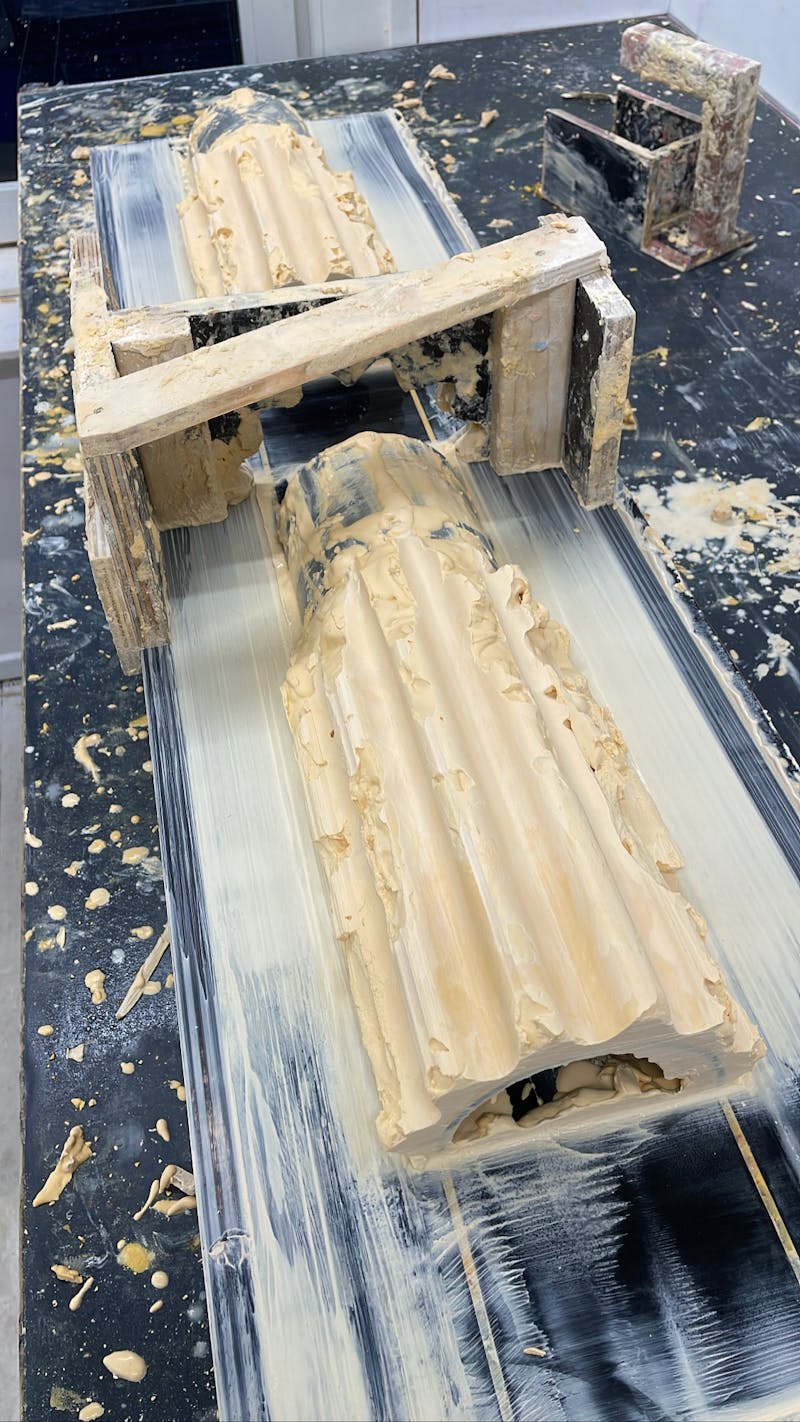
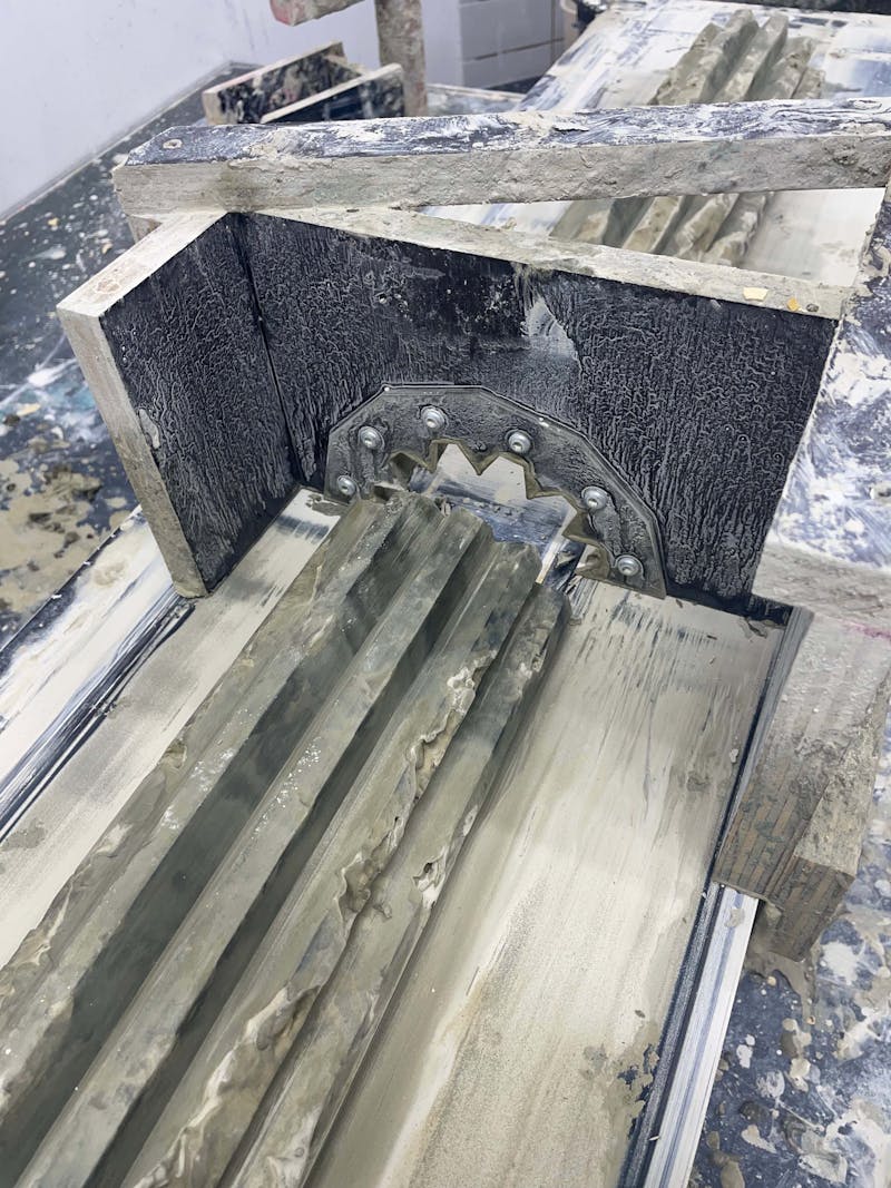
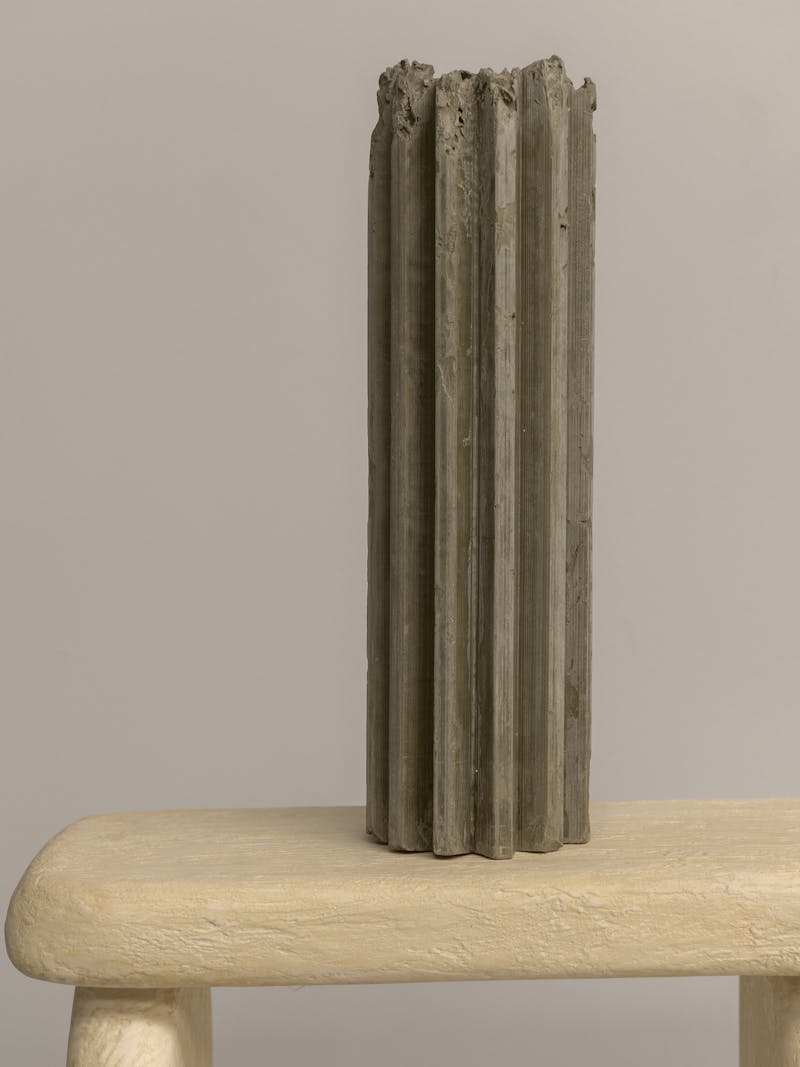
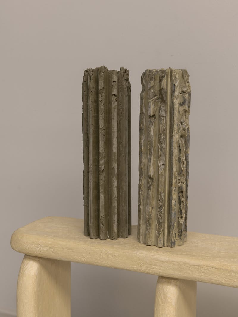
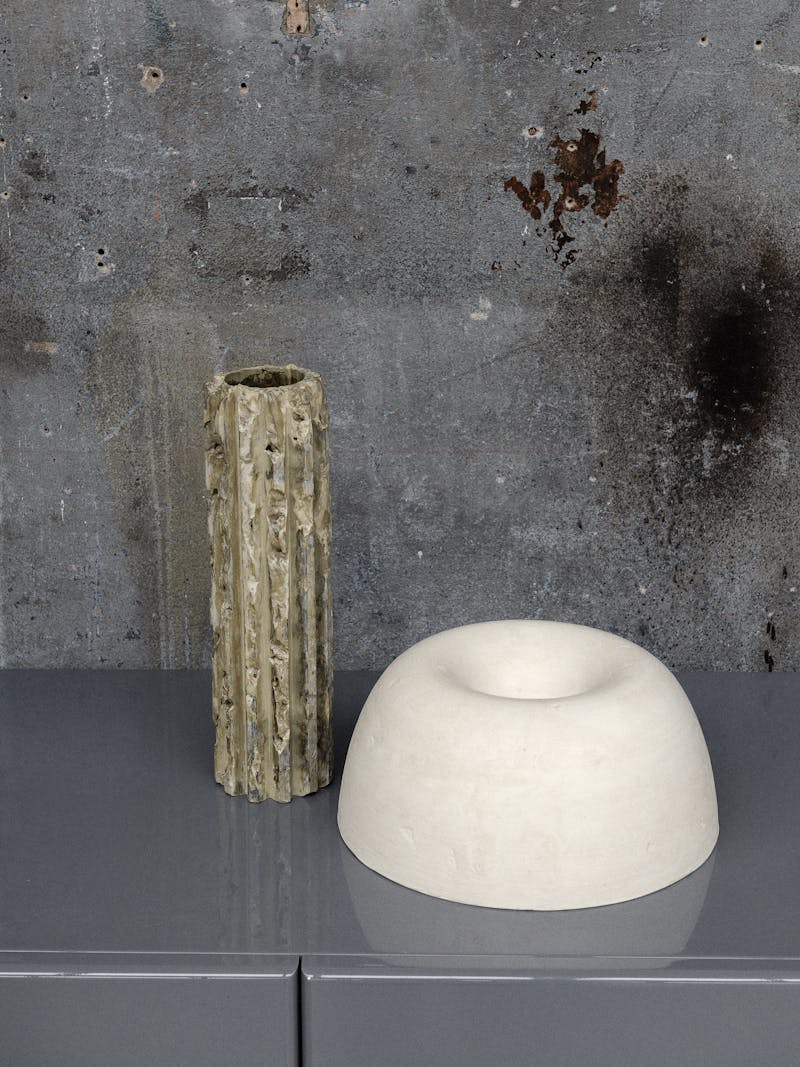
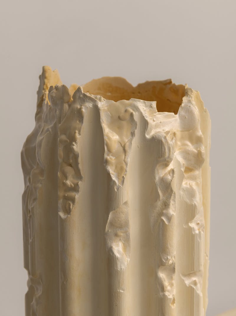
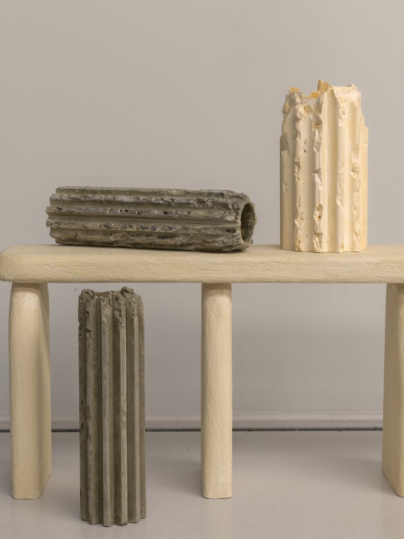
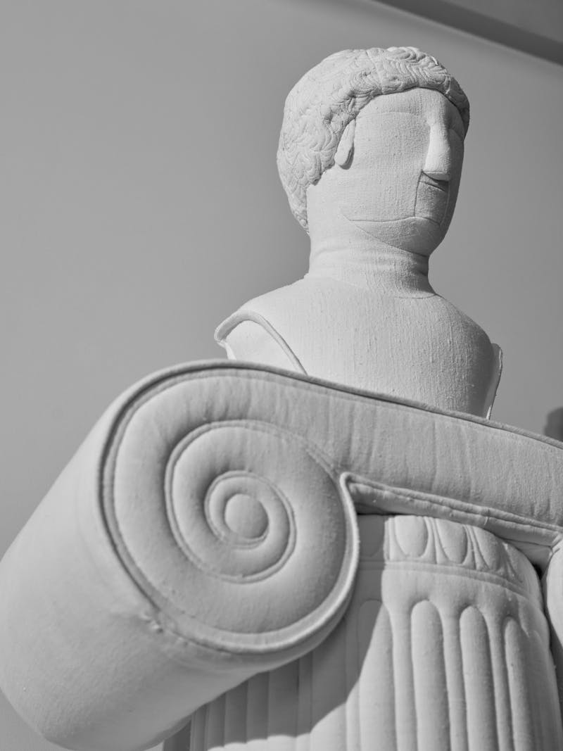
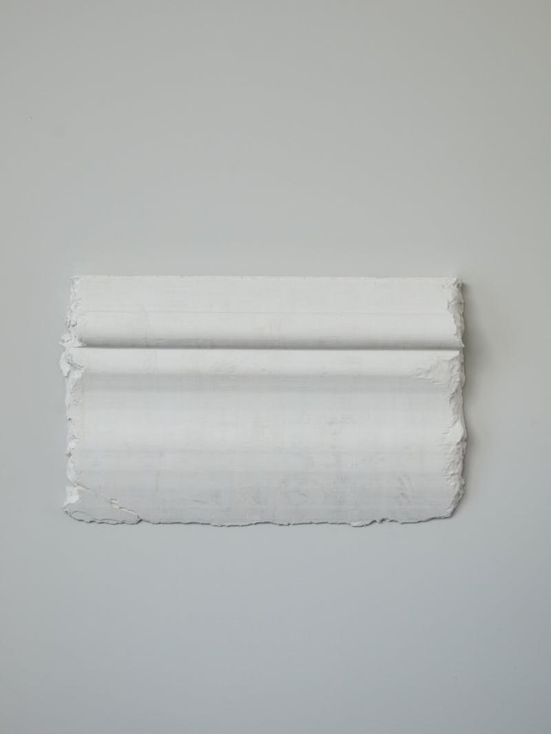
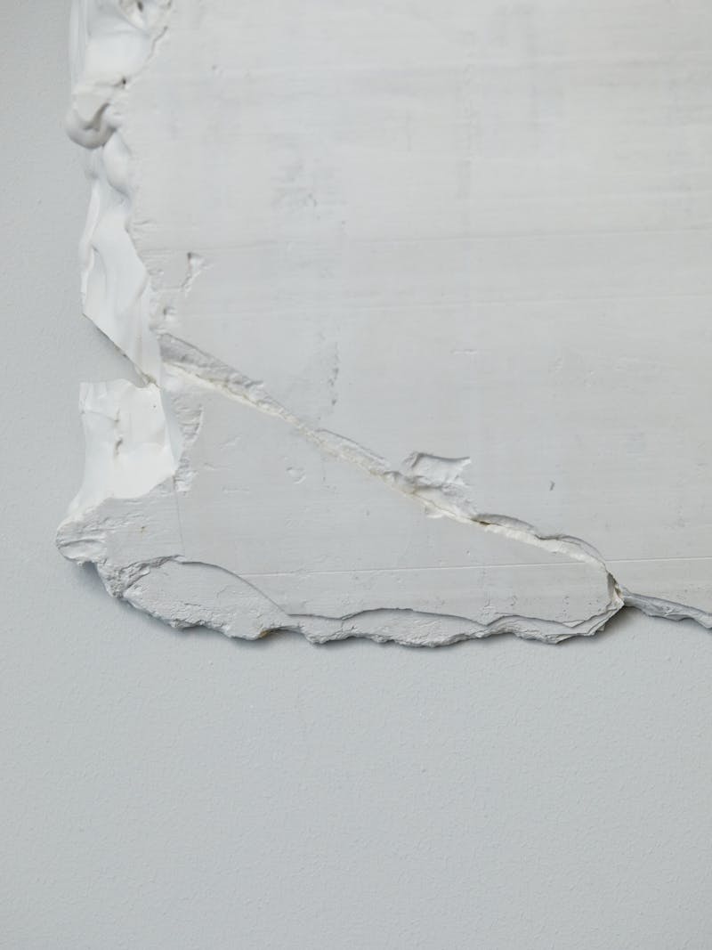
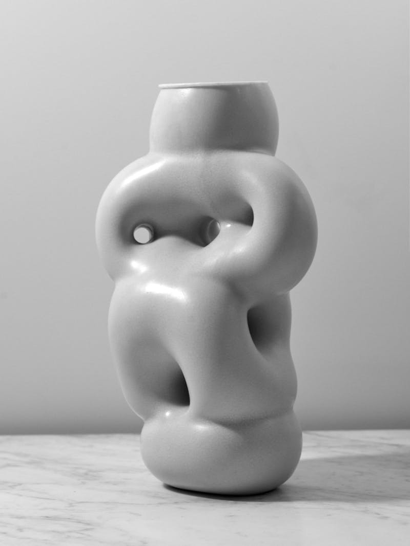
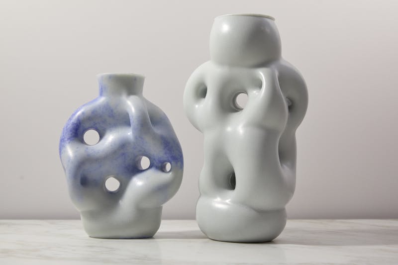
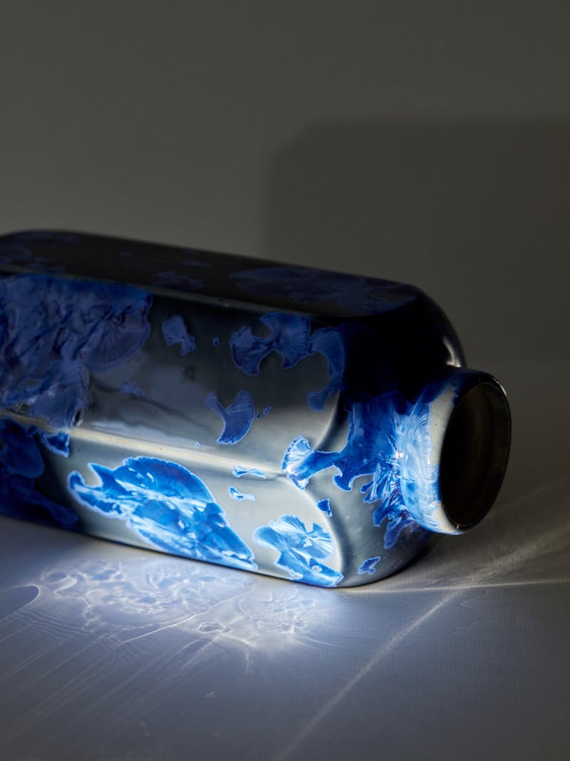
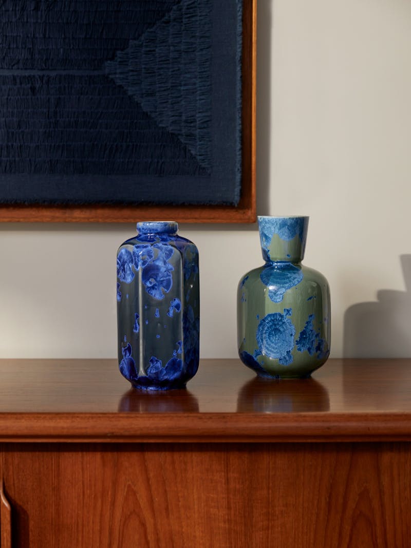
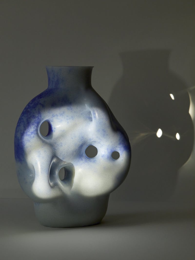
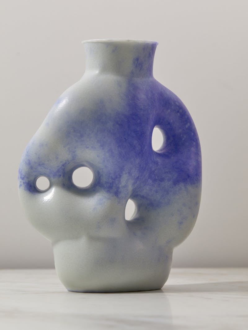
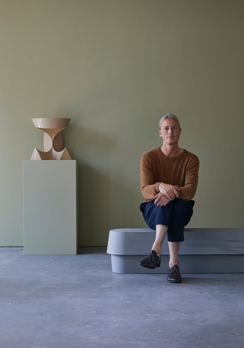
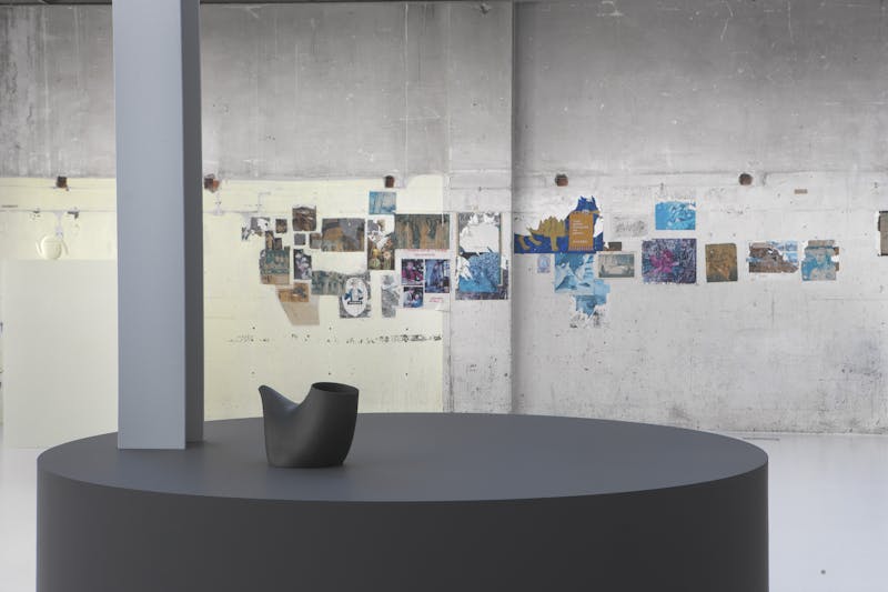
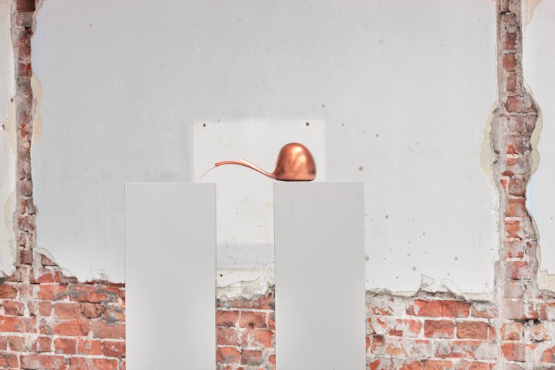
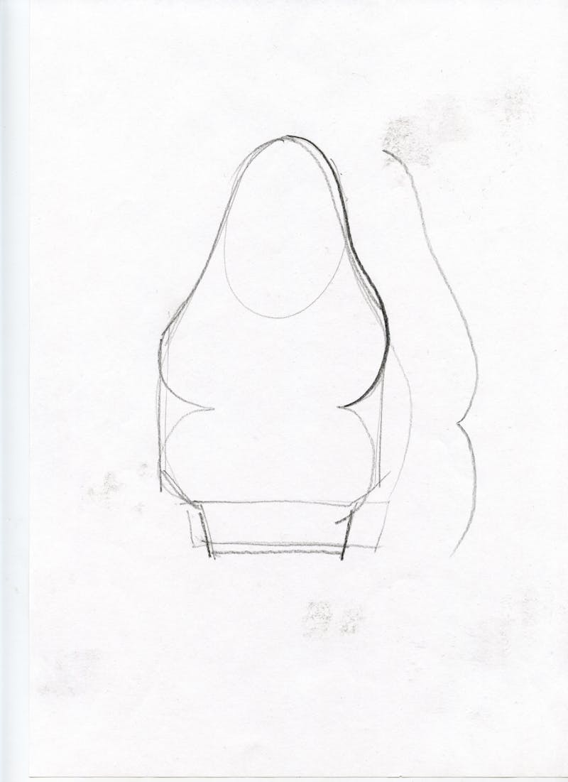
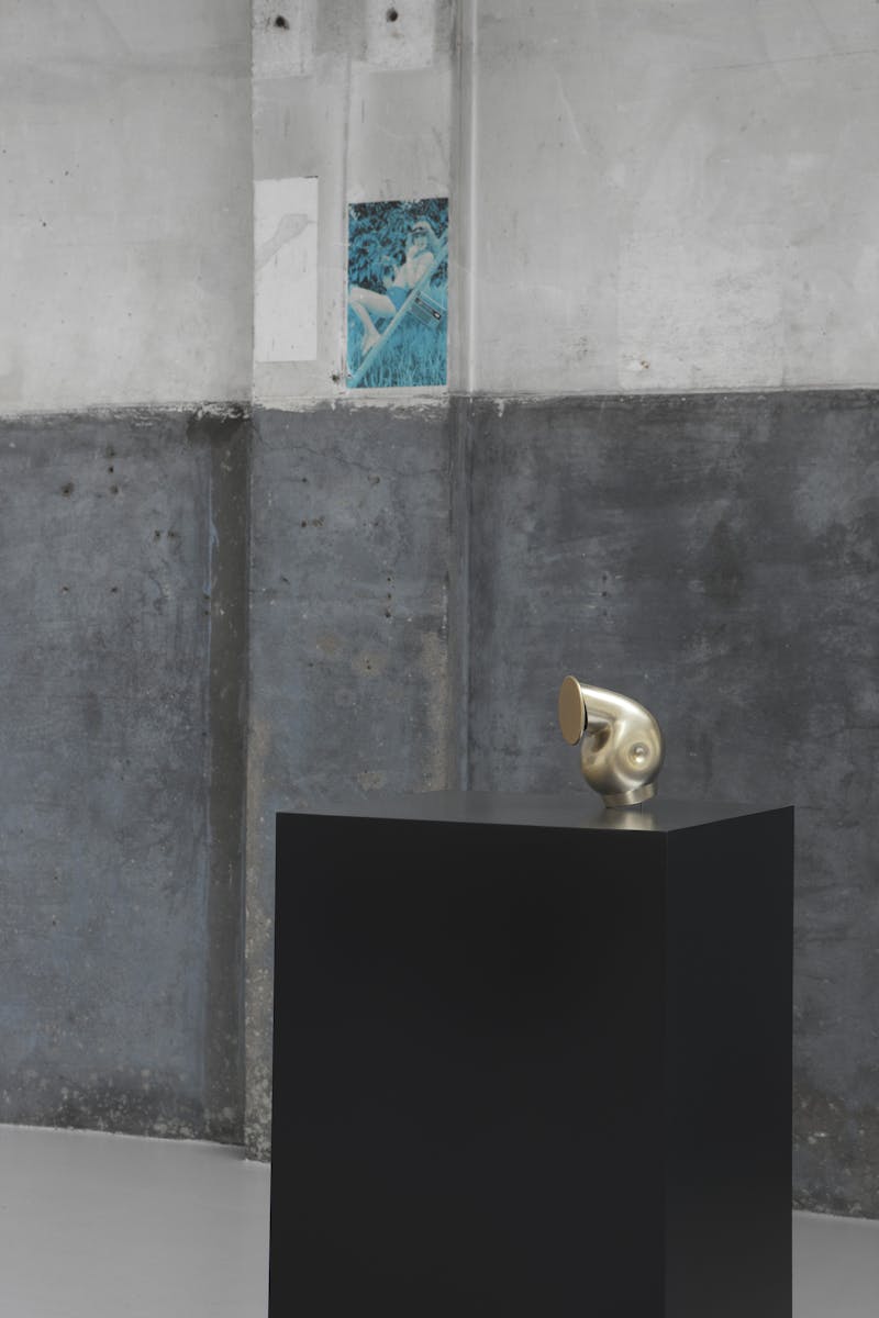
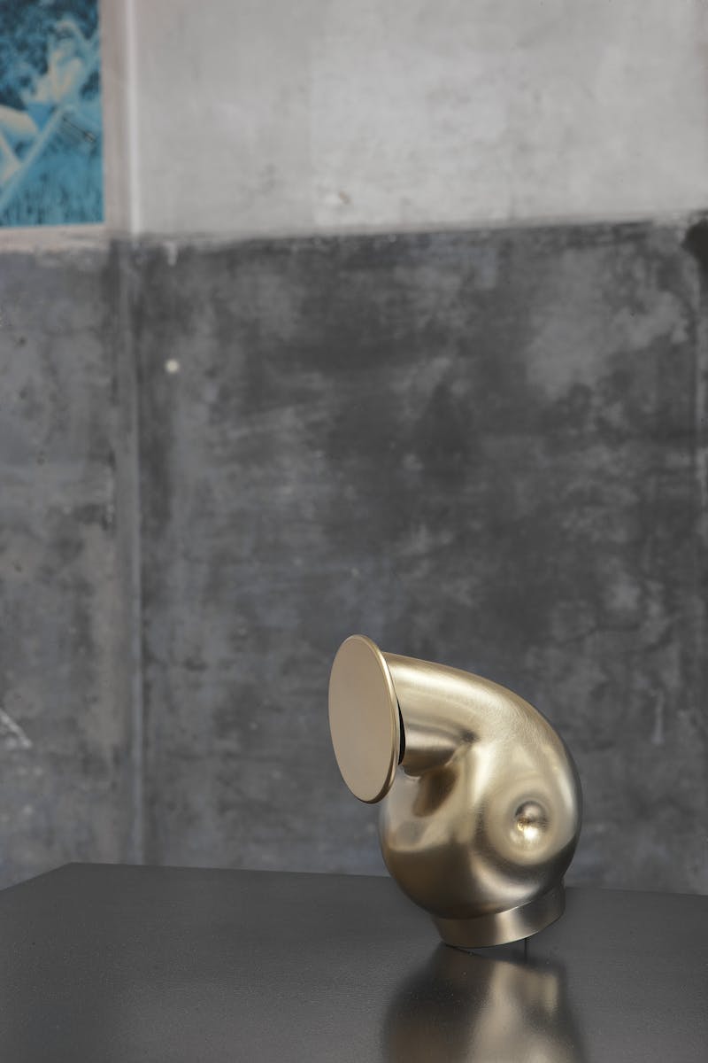
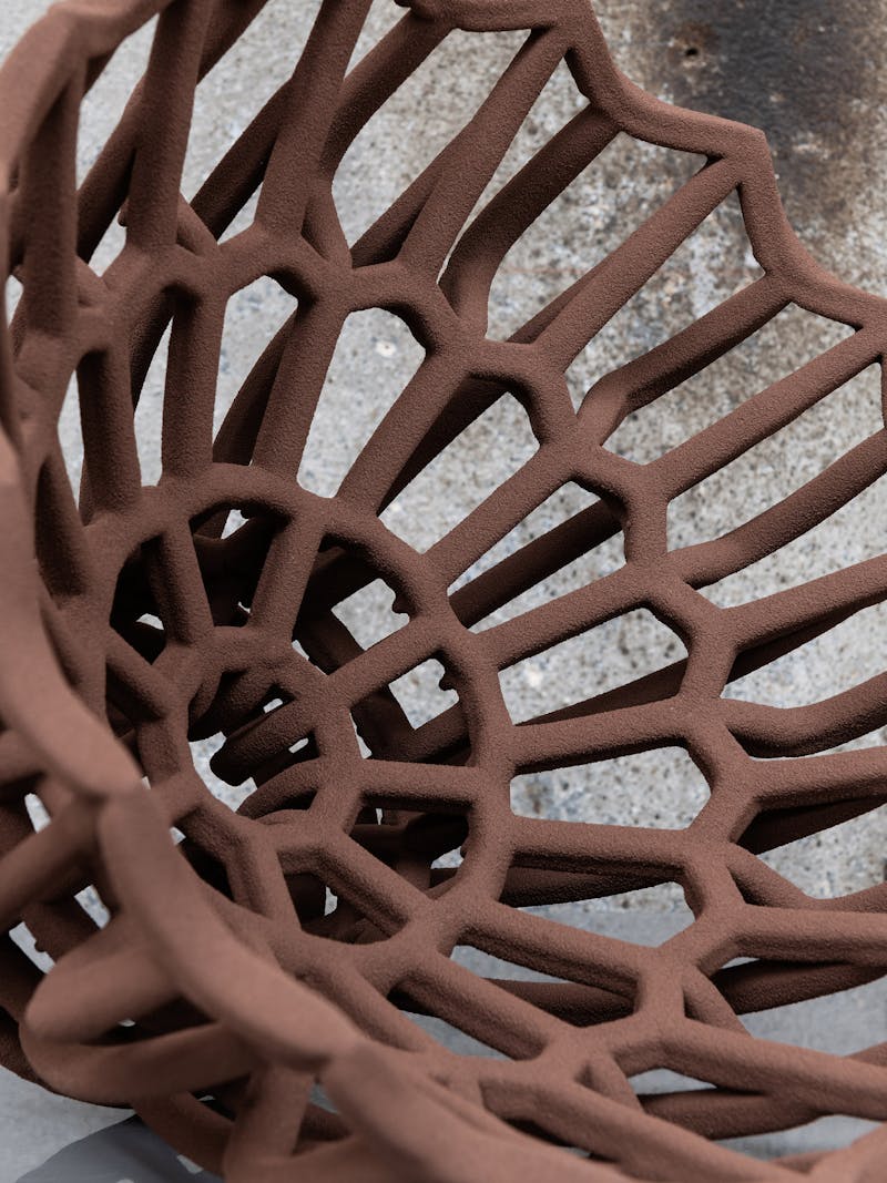
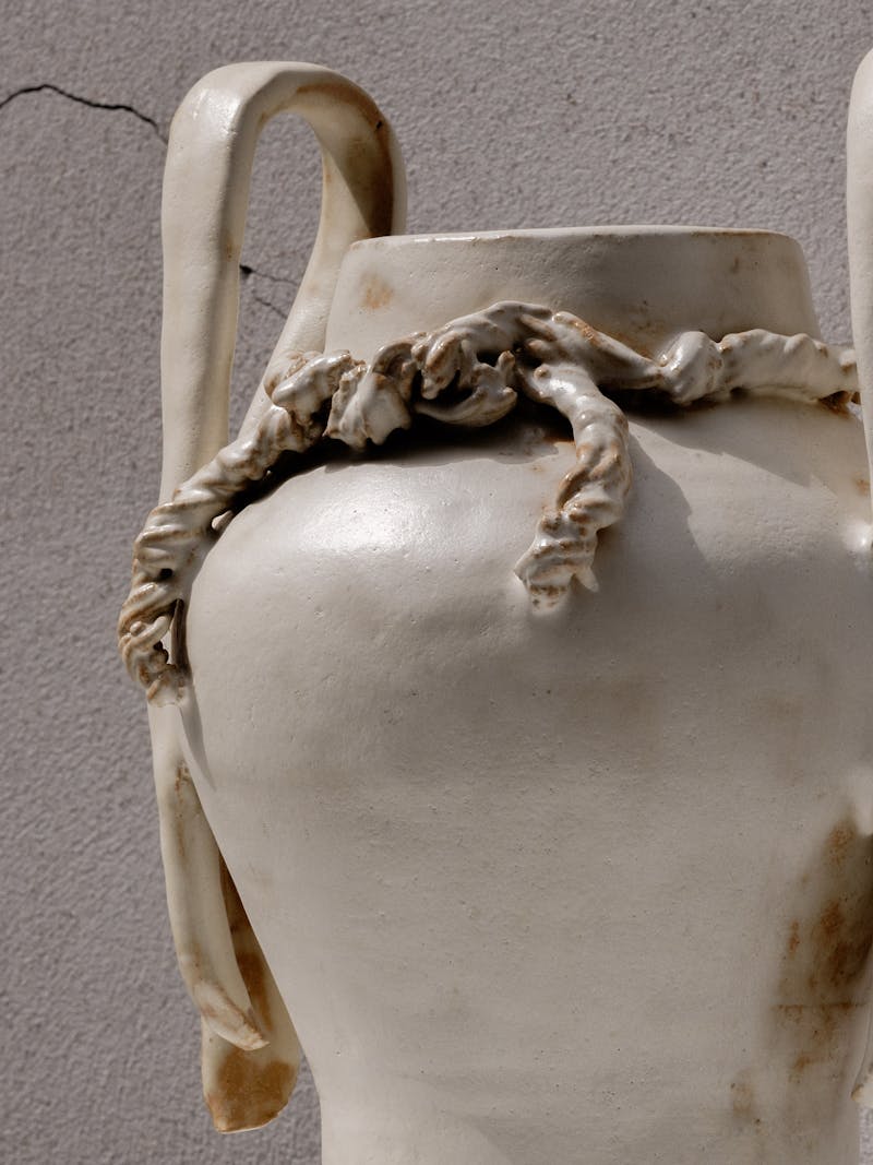
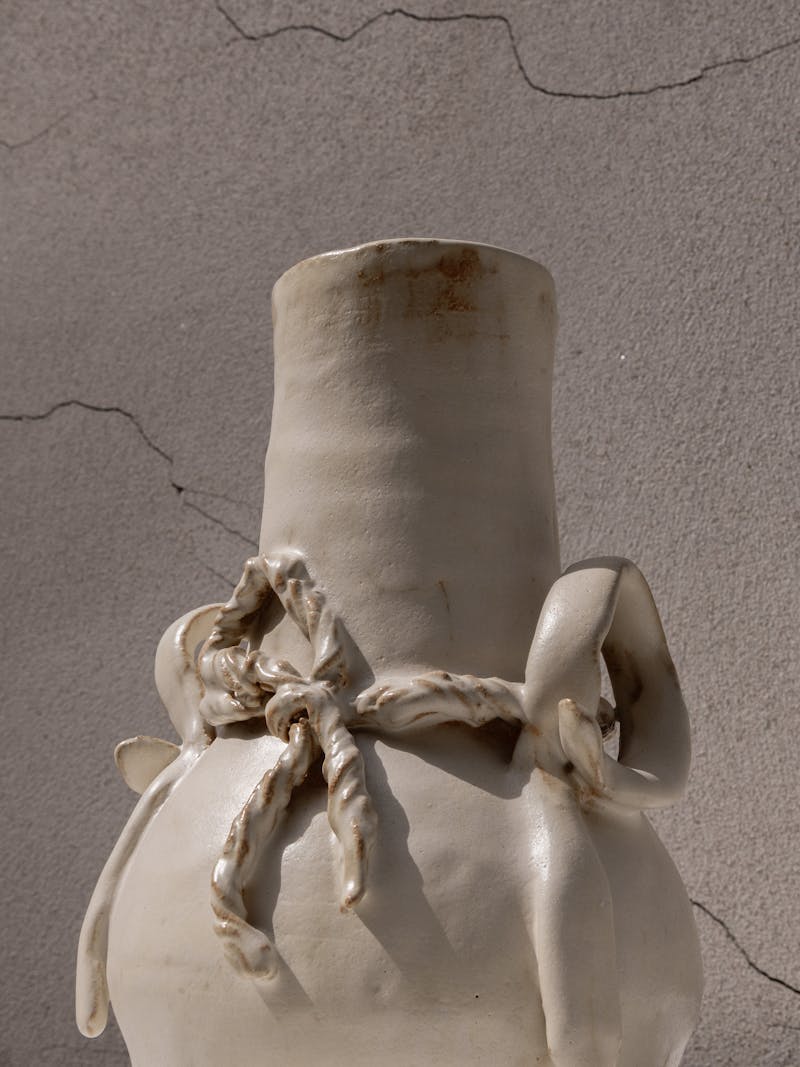
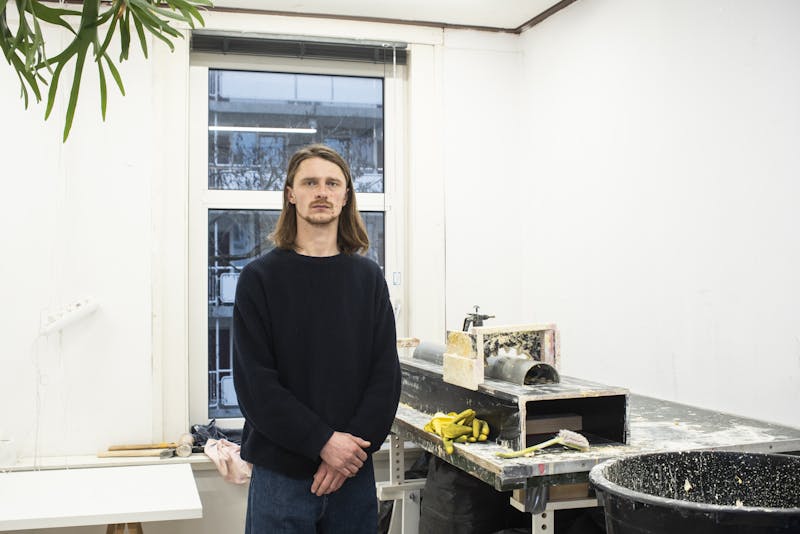
For the new spring collection “Observations” by Metamorphoses Objects, Rotterdam-based designer Lenny Stöpp has crafted a collection of beautiful Cornice Vessels and Twirl Bowls. Recently, we visited him in his studio to chat about his ‘Cornice’ project. We delved into his creative process, sources of inspiration, future aspirations, and the importance of observation in the journey of getting to know his material — literally and figuratively. His special ‘Cornice’ series emerged as a graduation project in 2019; Lenny, however, was deeply intrigued by the techniques he learned under the guidance of a mentor at the academy, spurring a dedicated commitment to his craft. Now – four years later – the project continues to evolve and his authentic pieces can be found across the globe.

Starting at the beginning, what sparked the inception of the 'Cornice' project?

The origins of the ‘Cornice’ series trace back to an academic project, in which I wanted to investigate how ceramic techniques could be applied in a production-oriented manner while still containing subtle, evolving variations within each design. This led me to dive into the realm of plaster casting – an ancient, almost-obsolete method of pouring plaster into a mold and applying a template over it to reveal its shape, similar to a theatrical performance. It’s a simple craft that offers a variety of other methods, from mold-making to clay casts. While the final form is usually the spotlight of attention, I found the process of shaping the mold itself to be inherently poetic. This project highlights the beauty of simple actions and the often-overlooked process of making itself.

A ceramic vase 'Cornice vessel' by dutch designer Lenny Stopp for metamorphoses objects gallery

Image 1 — A process image from Lenny's studio in Rotterdam. Here Lenny is shaping the mold of one of his 'Cornice Vessels' for the 'Observations' collection.

A ceramic vase 'Cornice vessel' by dutch designer Lenny Stopp for metamorphoses objects gallery

Image 2 — Lenny finds the process of shaping the mold itself to be inherently poetic. With his project he wants to highlight the beauty of simple actions and the often-overlooked process of making itself.

In the meantime, you've made many vases. Did you have a specific form or function in mind?

Initially, my focus was merely to explore the textures and structures of the material when making flat objects. One of the challenges I encountered was excessive moisture retention. Through further experimentation and testing, I discovered new methods of construction that eventually led to the creation of the Cornice vases, marking my first design objects. In the initial stages, the vases exhibited a clean aesthetic with precise lines, as I aimed for perfection in their form. Now, the vases embrace imperfections, offering a more structured and organic appeal.

What made you decide to move away from pursuing the perfect mold form and opt for the current design of the vases?

In my design practice, I always ask myself when each piece can be considered ‘finished.’ As the vases are constructed in layers, this originally meant once they reached a point of firmness. Now, I seek balance instead – a subjective decision based on when I find it visually interesting. This provided me with greater stimulation and inspiration compared to replicating a flawless mold. I replaced the strive for perfection with a more experimental and playful approach, which allows me to embrace the endless possibilities of my works.

Image 3 — An early 'Cornice Vase' exhibiting a clean aesthetic with precise lines, as Lenny aimed for perfection in the form when he had just started the project.

Image 4 — An early 'Cornice Vase' (left) next to a more recent version of the vase (right)with a more structured and organic appeal.

How are the vases crafted, and how does this process compare with the ‘Twirl Bowls’ series?

The molding method used in both the vases and bowls originates from classical ceiling ornaments. The vases are constructed from two half circles, which are made simultaneously but separately. Previously, I worked with more parts using larger molds but found that it took away from the creative process. Initially taking 3-4 hours with each vase, the process has been refined through experimentation to reduce production time by half, depending on the size. For the Twirl Bowls, I adopt the same technique but instead use a mold with a spinning axis. This enhances the colour shades, shifting my focus towards experimenting with colour within the bowls. Another key difference is the bowl’s shape, which does not allow for the same textures of the vases to be incorporated.


Image 5 — The molding method used in both the vases and bowls originates from classical ceiling ornaments. However for the 'Twirl Bowls', Lenny used a mold with a spinning axis. This enhances the colour shades, shifting his focus towards experimenting with colour within the bowls.

What valuable lessons have the material taught you?

Plaster teaches me a lot. The material requires time to release moisture, varying from a few hours to a few days. The temperature in my studio plays a significant role in this process; it reacts quicker in the summer due to changes in the material’s viscosity. Occasionally, I forget how much the environment impacts the outcome and the importance of understanding the material’s liveliness.


Are there any specific creators inspiring you at the moment?

I'm a big fan of Nordic Design. A pivotal moment occurred for me in 2019 when I visited Stockholm for the first time on a school trip, immersing myself in the city’s unique atmosphere. Despite the design world there being a new playground, it resonated with me deeply. From that moment on, I started focusing on Danish design, specifically minimalist woodworking, and discovered more experimental studios in Denmark. From the quality of the designs to their purity, I find that craftsmanship is prioritized there more than I had observed elsewhere. Two summers ago, I embarked on a solo trip through Sweden and Denmark when I faced a delay in graduation and sought a way to unwind from spending days alone in the studio. Everything I had previously seen online was now in front of my eyes. Establishing new connections in Copenhagen, I also had the opportunity to exhibit in several galleries there.

While I find the work of Danish designers Fos and Karl Monies particularly compelling, my inspiration primarily stems from how designers work. Karl Monnies, for instance, has a unique and longstanding visual language in his vase creations that is both autonomous and consistent.

Looking ahead, what are your plans for the future?

It's been 4 years since working on the ‘Cornice Project’. Recently, I have ventured into working with larger-scale objects and observing the differences that arise. This new journey began with a piece for the Dutch Design Week, where I faced fears of failing due to limited room for mistakes. The challenge of scaling up presented more risks and complexities, which was equally exciting and daunting. The weight and size of the piece prompted me to transition to a more spacious studio. This next step involves planning for the year ahead, including upgrading the website and improving my photography. Funnily enough, my sources of inspiration, like Fos and Monies, don’t have websites: their focus is purely on creating, granted they are from a different time. For me, it feels more complete if I connect the physical world with the digital, even if it requires more work.

Image 6 — The running cornice process allows for the possibility to reproduce each vessel, however each production run produces a slightly different finish and texture. Due to this production method, each vase is unique, and serves both an ornamental and practical function. The cream cornice vessel has vertical striations and a rough finish, which are evocative of ancient Greco-Roman column fragments. This vase is made exclusively for Metamorphoses.

Image 7 — On the floor sits one of the first 'Cornice Vessels' Lenny created, featuring a clean aesthetic and precise lines. On the bench are two of the unique vases Lenny made for 'Metamorphoses,' showcasing a more organic yet structured appeal. Currently, his approach is more experimental and playful, allowing him to embrace the endless possibilities of his work.

November, 2021 objects in conversation

Contemporary Archeology

Jorge Luis Borges wrote that ‘the present returns the past to the future’. This idea of the contemporary moment, as a bridge between our history and what is yet to come, is embodied in the practice of archaeology. The search for the relics of history, lying under our feet, are revelatory of the human instinct for the preservation and idealization of the past. To this day, ancient Greek and Roman aesthetic conventions continue to play an important role in the evolution of Western visual culture. As archaeologists continue to uncover more information about the ancient world, many contemporary artists and designers simultaneously explore the legacy of classical heritage: examining its relevance in society today and helping us imagine the world of tomorrow. What is it about these ancient artforms that is able to captivate and inspire each subsequent generation of creators? And conversely, how can contemporary art practice help foster understanding of the classical tradition?

 The following selection of works exemplifies how different designers incorporate dialogue between classical and contemporary artistic practice into their work.

Image 1 — 'Textile Ruins Bust' by Sergio Roger
In his bust and ionic pillar from the Textile Ruins series, Sergio Roger plays with the familiar artistic and architectural forms of classical antiquity. He questions the significance of these established symbols of ancient knowledge and civic power to audiences today. By changing the materiality of such iconic design elements, Sergio challenges the definitions imposed by the art historical canon. Through the replacement of traditional white marble with recycled fabric, these mighty symbols become softer and more domestic, blurring the boundaries between interior and exterior. The portrait bust is no longer an imposing ancestor glaring down at the viewer, and the column’s fundamental structural function is diminished. Purchase

Image 2,3 & 4 — 'Cornice (Breast - Belly)' by Romy Yedidia
A cornice is a crowning form from classical architecture, used for both the exteriors and the interiors of buildings. Romy Yedidia’s Cornice series carefully investigates the link between the titular decorative architectural element and the female body. The project was created through a series of performative acts over a long period of time, during which the artist moulded her body from multiple perspectives. Cornice represents an inner battle against time and gravity: exploring the discordance between society’s unrealistic beauty standards and the passage of time. Each work from the series is both monumental and delicate. The fragility of the work itself, with its cracks and chipped corners, reflects the inevitability of decay. Purchase

Image 5 & 6 — Impose Vessel IO by Handmade Industrials
The Io vase is part of the impose vessel series created by the design-duo Handmade Industrials in a special collaboration with Metamorphoses. This pearly grey work pays hommage to Io, one of Zeus’ mortal lovers. According to the legend, Zeus transformed Io into a white cow: both to hide his infidelity from Hera and to spare Io her wrath. But his ploy was foiled, and Hera in response sent Argus, a many-eyed giant, to watch over Io and prevent Zeus from seeing her. Whilst Handmade Industrials’ new piece demonstrates the powerful legacy of the stories immortalized in Ovid’s Metamorphoses, they also show the duo’s characteristic application of innovative and self-designed manufacturing techniques. They create flexible moulds using balloons filled with biodegradable granules, which are used in turn to create one-off objects – the character of which emerges during the production process. Purchase

Credits: Photograph 1 — 6 taken by Myrthe Giesbers

November, 2021 objects in conversation

Blue Mythology

Blue is the colour of the sea and sky; it is both a melancholic and peaceful colour; it is the colour of the unknown. In Greek mythology, blue is often tied to metamorphosis: between the human, the animal, the vegetal and the mineral. Although the ancient Greeks believed light blue had the power to ward off evil spirits, they did not have a specific word to designate the colour and only categorised colours as either ‘kyaneos’ (dark) or ‘glaukos’ (light). This polarity between light and dark, hope and despair, is echoed in the duality of the sea and sky. In her book, Blue Mythology, Carol Mavor describes blue as a “particularly paradoxical” colour: “blue is the purity of the Virgin Mary, yet blue names a movie as obscene.” Blue holds complex symbolism in our society. Many of the artists featured on Metamorphoses incorporate the colour blue in their work. Below you will find a selection of works which explore the colour from different perspectives, incorporating and reinterpreting its multifaceted mythologies and meanings. 

Image 1 & 2 — Vases by Milan Pekar
These two beautiful vibrant blue porcelain vessels are made using the artist’s innovative proprietary crystal glazes. His innovative material experimentation enabled him to create unique colour combinations and textures based on spontaneous dynamic growth of crystals. The surface of both vases appears almost liquid, covered in organic shapes in a saturated sapphire blue. The swirling patterns resemble moss or barnacles growing on the surface of the vase, or remind us of clouds of smoke in the night sky. Purchase

Image 3 — Sophie Rowley Khadi Frays 11/12
Sophie Rowley’s ‘Blue Pieces’ is a diptych of textile wall pieces from her ‘Khadi Frays’ series,  inspired by the Khadi Spirit, an Indian concept referring to a state of illimitable patience. The differences in weight and tension of the warp and weft create subtle colour variations in the blue textile, which change based on the viewer’s perspective. Sophie transforms modest materials into intricate arrangements: giving a modern twist to the ancient textile craft. Purchase

Image 4 — Ella Bulley, bu volta he plates 
Custom made for Metamorphoses, this plate duo is part of Ella Bulley’s ‘Ye O Niyenii’ collection which celebrates Ghanaian food culture. These works are specifically linked to the Ga tribe’s Homowo festival that commemorates the abundant harvest which signalled the end of a historic famine. Ella borrows the colour symbolism from the Kente cloth tradition: the blue signifies peace, love, togetherness, and the green symbolises the land, crops, harvest and spiritual growth. Purchase

Image 6 —The Argo vase is part of the Impose Vessel series created by the design-duo Handmade Industrials in a special collaboration with Metamorphoses. The vessel is made from biodegradable granules, melted and then physically restricted in a flexible balloon mould. Inspired by Ovidian stories, this vase represents Argos, a giant covered with a hundred eyes over his entire body. He was sent by Hera to watch over her priestess, Io, who had been transformed into a silver heifer as punishment for attracting the wandering eye of Zeus. In the creation of the vessel, special emphasis was placed on the creation of the holes, which represent the eyes. The bright blue splashed across the surface of the vase represents the blue eyes of the giant, the same deep blue colour of the Mediterranean Sea. Purchase

Image 7 — Emma Terweduwe Gradient Blue 
For her collaboration with Metamorphoses, Emma Terweduwe has created two new plaid blankets woven in wool, mohair and cotton, each uniquely finished by hand. One of these pieces combines bright blue, green and beige yarn, creating playful details in colour and texture using a crochet technique. Inspired by the world-famous textile traditions of Belgium, the blankets feature different designs on either side, allowing them to be repositioned, redisplayed, and enjoyed again from many different angles. Purchase

Credits: Photograph 1 — 7 taken by Myrthe Giesbers

December, 2021 artist in conversation

Aldo Bakker

In early 2015 ahead of Aldo Bakker's upcoming solo exhibition at Looiersgracht 60 in Amsterdam, we met with the designer several times to discuss his work and a number of relevant themes. Three of Aldo's beautiful pouring vessels that were on view at the exhibition at the time are currently available at Metamorphoses. To learn more about Aldo and his work you can read through a slightly abridged rendition of our ongoing conversation below. This interview was officially published in the limited-edition publication 'Containing Content' alongside essays by art critic and writer Hans den Hartog Jager (NL), design writer Glenn Adamson (NY), design critic Gert Staal (NL) and journalist Chris Reinewald (NL).

Nadine Snijders (co-director Looiersgracht 60/Metamorphoses) and Soraya Notoadikusumo (co-director Looiersgracht 60)

You were born into a family of prominent designers: the avant-garde jewelry designers Emmy van Leersum and Gijs Bakker. Your father co-founded the influential Droog Design group in the mid-1990s. Were they a major influence in the formation of your style and oeuvre?

Aldo Bakker (designer)

I’m often asked about my parents’ influence on my work, but I always find that a hard question to answer. Last year, when I was asked to take part in ‘Le Labo des Héritiers’, an exhibition about ‘creative’ families, I again spent a long time pondering the question. If you go in search of connections between family members, you will naturally find them. But as I was preparing that exhibition, it also became clear to me that each one of us has devised a distinctive working method.

The main thing is that I’m a product of the creative environment in which I grew up. As a child I was constantly being carted off (sometimes against my will) to exhibitions, to the opera or to see buildings with remarkable architecture. We travelled a great deal. Because of this, I learnt my own way of allowing things to sink in, and to make connections between one thing and the next. It’s how things affect me and what I then do with them to eventually make a work out of them that’s the most interesting thing as far as I’m concerned.

NS + SN

How did you decide to become a designer?

AB

When I was sixteen, my father took me to an exhibition of glassware in Leerdam, which hugely impressed me. It was then that I started making my own drawings. After that, I enrolled at three different acade- mies, but without success. The longest period I ever spent studying at an academy was eight months. I couldn’t settle in, because my own questions – which were and are still absolutely central to my work process – made it impossible for me to work in the way that was expected. We were constantly given set assignments, and that didn’t work for me. Even so, I nev- er wavered in my decision to become a designer. After leaving school, I went to work in Utrecht, in the stu- dio of the designer Willem Noyons. I spent eight years there making mod- els, jewellery and ironwork. Those activities gave me a great deal of peace and the space I needed to think about my own work. Sometimes I spent all day on one object, and when you’re so close to something, manipulating it so intensively, you develop a particular sensitivity to that object. You’re acutely aware that the tiniest in- tervention on one side will have consequences for the other side.

NS + SN

You have followed an unusual path, making a series of decisions that led you to become self-taught and that have ultimately led you to where you are today. Where did you draw your inspiration from?

AB

I only absorb information that can somehow contribute to my creative process. I go by my intuition and my imagination. Once I have a concept, I test it in sketches. From the age of sixteen I knew that this was what I wanted to do, and I embarked on my research. Every week I would go to the bookshop Architectura en Natura, where I studied architecture books, focusing especially on the work of Carlo Scarpa, Elladio Dieste and Enric Miralles. Although I have not lost my interest in architecture, those books fascinate me far less now than they used to; it more or less stopped with Sanaa architects.

NS + SN

In a world dominated by vogues and band- wagons, many designers are most con- cerned with responding to current trends, be they social, political or aesthetic, but your work has already been described as timeless. Marie LeFort once wrote in an article: ‘A designer, craftsman and visionary in his own right, Aldo Bakker’s quiet genius stands the test of time.’ What do you think of being associated with the quality of ‘timelessness’?

AB

I can think of numerous designers and architects who have been faithful to their zeitgeist and who make extremely good work. But you can’t always be sensitive to the zeitgeist, and I wouldn’t want to be. In my work I follow my intuition, and I hope that my method can help my work to become more and more in- teresting as I get older. In most cases, you tend to see the reverse.

NS + SN

How do you intend to prevent yourself from stagnating? Are you afraid of losing your love or passion for design, or your creativity or motivation?

AB

I am always motivated by my own per- sonal aspirations, by the pure need to create things. That can only work if you are open to what you see and you think about it. From the moment I start collecting images in my mind, and sometimes even make a few sketches on paper, there is already something there. That’s where creation begins. And that is driven by a certain motivation. My work is not born from necessity: it is essentially useless and no one feels a need for it, but if the end result is good, people are pleased. Until that moment, I face the challenge alone. It’s essential to find a way to deal with this. That motivation is extremely vulnerable. This is a subject I often discuss with my students. It became clear yesterday, during a class discussion, that it is generally fear that holds students back. There is always a moment at which they feel besieged by doubts about what they have done thus far in the design process. They are beset by self-criticism, and their doubts become so strong that they end up betray- ing their own principles. That is very tempting, but not constructive. You have to give an idea a chance to grow. It’s only after that gestation period thatthere is any point in challenging the idea with specific questions.

NS + SN

Your designs lie at the intersection of aesthetic form and functionality. How do you begin the process of creating an object? Does form lead to functionality or functionality to form?

AB

In my work, form is the starting point. The form is related to a particular action or movement. If I’m designing a container, for instance, I think of how the fluid will behave in the jug, and the sensory experience you have when you hold a jug. I keep referring to the form I gave myself; function is always subordinate to form. Sometimes my objects are therefore less functional than they otherwise could be. I don’t spend much time wondering where the product ought to be marketed. Other designers are good at that since they work in response to the market, but that’s not my approach. Form remains my point of departure until the very last moment. Take Salt Cellar, for instance. It was only at a very late stage that I de- cided it could be used for salt. In this case, the object eventually became functional. With Salt Cellar, it was truly the shape that led to its functionality. I like that: you pick it up, tip it forward and tap it to shake out the salt, which is slowed down by the small bump in the bowl. The edges of the bowl are turned inwards at the front, stopping the salt from spilling out, while the sides have gentler curves, enabling the salt to be shaken from there.

NS + SN

Considering the years of discussion about the traditional boundaries between disciplines, how do you see your work in relation to the art-versus-design debate?

AB

My work looks both ways. It is the task of curators and critics to name and classify things. An artist or a designer has a different task: to find new terri- tory. I myself can only do what I do – design – and get better at it. I spent years thinking about whether I ought to develop in the direction of either art or design. Today, I’m glad that my work hovers in some intermediate zone between several disciplines.

NS + SN

Your designs often transform mundane objects into things that look almost otherworldly but nevertheless remain functional. Is it important to create a triangular relationship between yourself, the world and your work?

AB

That is something I find absolutely crucial. It’s precisely the applicability, the approachable aspect of a design, that I find important. I don’t want to make things that look unnatural or that distance themselves from us. I don’t believe in that. What I do, I do for us – for me and for you. If you were not there, I don’t know if I would make the things I make. But there’s another thing. The views of people who are important to me are very valuable. They sometimes point out aspects of my work or my method that I had not yet experienced or seen in that way, because I’m too close to them. In 2008, Jan Boelen was the first person to say that my work demands to be touched; that hadn’t occured to me. And my former colleague Lisa Smit was the first to say that I am totally led by my feeling. It shocked me at the time. I had been so absorbed in questioning and rationalising my work that I didn’t immediately associate the idea of being led by feeling with my own working method. But she was quite right, of course.

NS + SN

You appear to have a special preference for two kinds of objects: jugs and stools. With an eye to this exhibition, what is the origin of your fascination with jugs?

AB

I think jugs have a special appeal for me because of their position as the ‘head of the family’. Everything comes together in a pouring vessel: once you place it on the table, it takes the lead. A jug or pitcher sets the tone and indi- cates a particular direction. In a sense, it’s all you need to possess; theoretically, you could even drink from it directly. So many facets converge in a pouring vessel. For me, that’s an inviting point of departure, which is why I continue to make them and keep discovering more about them.

NS + SN

As you continue designing pouring vessels, do you notice any development or evolution in your work?

AB

Yes I do, since each one is very different. I’m constantly questioning the re- lationship between the parts in order to arrive at a necessary balance. I’m interested in asking why a particular pouring vessel looks the way it does. Sometimes I see a particular shape in architecture. A banister, for instance. It might arouse a particular feeling in me, and that might be the beginning of a new jug or pitcher.

Image 1 — Pipe exhibited at Looiersgracht 60 (Amsterdam) in 2015.

Image 1 — Pipe exhibited at Looiersgracht 60 (Amsterdam) in 2015.

NS + SN

Giorgio Morandi purposefully limited his choice of still-life objects to the mundane bottles, jars and jugs that he found in his home. By removing their labels and paint- ing them in matt colours, he removed the objects’ characteristic traits and made them anonymous. How do you see your jugs in relation to Morandi’s approach of depersonalising the objects he portrayed?

AB

Yes, it’s true that Morandi did that. It gave him more space and freedom, as form was the only thing left to deal with. With each object I make, I have all sorts of feelings: about what type of thing it is, whether it is quiet or modest or eager. I love exploring the character of the new thing. Let me explain what this means to me, taking Pipe as an example. Pipe is a thing that I associate with a desperately fat creature. The size is really important. Its design is subordinate to its mass, as a result of which the openings of
this pouring vessel appear adrift in the surface. Pot is completely different: it is halfway between speed and rest. If its arms are fold- ed in, it looks like a pill balancing on edge, going neither forwards nor back- wards. With the arms folded out, on the other hand, it creates the suggestion of speed and direction. I have a funny little sketch in which it looks as if it’s poised for the start of a race.

NS + SN

The study of proportion seems to play a role in the creation of your objects. Many of them consist of triangles, squares, spheres, pyramids, cones or other geometrical figures. Do you ever use mathematical models, or do you work more intuitively?

AB

I never use geometrical studies to arrive at a particular shape. I always start with a form, and go from there to discover the underlying principle, by drawing and puzzling it out. Once, when I was just starting out, I set myself the assignment of finding all the things I could do with triangles and circles. I thought
it was necessary. I set out to define my own way of approaching circles, squares and diagonals. Once I had grasped the underlying logic, I started thinking about the way in which I could use the shape for an object. I didn’t do so consciously, using the golden ratio or whatever; I simply carried on until it looked right. For me it is the philosophy behind an object that matters most, not its mathematical foundations. I’m sure that some mathematical logic could be discovered in my designs, as that ap- plies to everything in the end, but I’ve never consciously set out to find it.

NS + SN

Why did you choose these five pouring vessels for the exhibition (PivotPipePotSquare PourerSoy Pourer )?

AB

I did so purely on the basis of feeling. Afterwards I realised that this selec- tion displays a wide range of objects that pour. They are all objects I devel- oped together with my own craftsmen. Since we have already been collaborating for years, we can tackle the work with great precision – I don’t need many words to explain what I mean. Aside from that, the exhibition is above all an effort to get a firmer grip on my fascination with pouring vessels – objects that, for me, yield rewarding and fertile concepts.

Image 2 — Soy Pourer exhibited at Looiersgracht 60 (Amsterdam) in 2015.

NS + SN

Which one do you feel closest to?

AB

I find it hard to say which jug I feel closest to. It’s rather an unfair distinction to have to make – as if you were asked to choose your favourite child. But now that I think about it, I’m inclined to say Pivot. When I first drew it, I immediately saw that the form was important to me. The design grew organically. I had the shape in my head, sketched it on paper, and there it was. I modified the dimensions, but all the elements are the way I had initially conceived them. It’s one of the first pouring vessels to which I added a loose element: a lid. That was a big step for me, since I only want to use a lid if it stands in some relationship to the thing. The lid has to work and move, but it mustn’t speak a different language from the rest. The little ball from which the lid hangs was a great find. To me, the fact that you can imagine removing the little ball from the indentation in the object pro- vides its raison d’être.

NS + SN

The design critic Alice Rawsthorn once wrote in The New York Times: ‘Aldo Bakker [...] is one of the new wave of designers who could be called design-auteurs for the same reason that François Truffaut dubbed his generation of experimental French filmmakers “auteurs” in 1954, because they treat their work as a medium of self- expression.’ As it is hard for us to see the journey – and to have proof of a journey when we are confronted with your final object – to what extent do you see your work as a product of self-expression?

AB

That’s a great question. All sorts of modifications take place during my design process, but in the final work, there are no traces of the thinking or making process. That would only be a distraction. The thing must be fully-fledged and independent when it leaves my studio. Hella Jongerius leaves the casting seams visible in her porcelain vases. She was the first artist to do so. I understand why she choos- es to do this, but that approach would not be appropriate to my work. I don’t want to include any everyday or existing factors such as technique and craftsmanship as parts of the object. I try to ensure that all attention focuses solely on the essence of the thing itself.

NS + SN

Today in design, but also in other disciplines, the process and research involved in a project often receive as much attention as the final result – and they are also made accessible to the public. Flaws, mistakes, re-workings, imperfections and any incomplete elements are shown. How do you feel about that?

AB

In my surroundings I often notice a strong focus on research into process. At best, process material may be striking and surprising, but as I just said it is often mainly a distraction. I sometimes think: if you had waited a little longer, it would have been better. Deciding what you want to show and share is a personal choice. Personally I tend to hold back on sharing my context and inspiration. I want to surprise and to seduce, and I’m afraid that explanations might get in the way. When I look at exhibitions myself, I hope to be completely overwhelmed, right up to the point of getting tears in my eyes.

NS + SN

Do you have a different work process when you are working for yourself rather than working on commission?

AB

I find it difficult to work on the basis of an imposed context. The way I approach commissions is to en- sure that I always do a lot of work in advance. So I give myself an assignment to make some designs, and I can use those designs for a commission later on. Working on commission for a company, for example for Sèvres, brings you into contact with other craftsmen, techniques and rhythms, and all that forces you to make con- cessions. When I work on commission, I sometimes drive people crazy with my focus on details. That is sometimes awkward when time plays a role in a commission. I need a certain warm- up period in order to judge wheth- er something is good or not. When I’m working with my own craftsmen, I don’t have to make as many concessions and I’m less weighed down by the pressure of time. Since we know each other so well, we can get to the heart of the matter very quickly.

NS + SN

How much time do you spend on an object?

AB

It varies: it might take a year, or it might take a week. Pivot, for instance, went extremely fast, but Pipe took much longer. A pipe is a familiar shape, but precisely because of that, it took time to inject fresh meaning into it. While I was making my sketches, I wanted to get a grip on the shape and understand it from every angle. There were many earlier versions before I arrived at the eventual form. I like to let something sit for a while and come back to it later. It is only by thinking endlessly about something that I eventually get somewhere with it.

NS + SN

Do you ever discard sketches or designs once you’ve started on them?

AB

No. In fact, if I were to come across the drawings I made when I was sixteen, I’d be able to pick up where I left off and carry on with them now. Wood is my favourite material, but that’s not to say I produce my best work with it. It is my favourite material in terms of execution. When I was making jewellery, I had difficulty with the sharpness of the materials and found the underlying technique prob- lematic. The fragrance and warmth of wood appeal to me far more.

Image 3 — Sketch by Aldo Bakker of Pivot..

Image 4 — Sketch of Soy Pourer by Aldo Bakker.

NS + SN

But there is no wooden pourer...

AB

No, we can’t pour from it, although Pivot would be beautiful in dark wood. Nowadays I tend to connect the identity of materials to the people with whom I work. So when I think of gold, silver or copper, I associate them with the methods used by Jan [Matthesius – eds.]. Jan has a highly meticulous way of working, which corresponds to my own. I always love thinking up something new that he might
be able to execute. The same applies to the other craftsmen I work with.

NS + SN

When people visit exhibitions, the pos- sibility of touching objects is almost non- existent. Your pouring vessels, however, are almost crying out to be held, stroked or used. May people touch your objects during this exhibition? Does the sensory experience that initially informed your design idea actually come back when you use the jug you created?

AB

Good question. With some of them it would be possible, but preferably under supervision. Pivot is a wonderful object to handle, and it would be great to give people an opportunity to do so. The same applies to Square Pourer. I never use my jugs as pouring vessels myself, but I do use them in my head. I try to create a shape for a sensory experience. Small children feel no sense of embarrassment about allowing themselves to be led by their senses. When I’m designing, I try to allow myself to follow my senses in a similar way. If I have a certain feeling with a movement or image, for instance, I try to capture that feeling and convey it in a specific shape. I make solidified material in order to cherish a sensory experience. But I am always afraid that its eventual use will be disappointing, since the shape has taken precedence over function in the design process.

NS + SN

Having returned to teach at one of the institutesthatyouleftyearsagotopursue your own training, how do you experience being back there as a teacher rather than a student?

AB

For me it’s distressing to see that the academy where I teach approaches everything from the vantage point of ‘problem definitions’ and has the urge to explain everything – whereas I believe it is far more important to have a different insight and vision to remain true to your own language and intuition. The teaching is too analytical. You too often see an exclusive focus on present-day themes such as the envi- ronment or sustainability. Those are interesting subjects, but the treatment is often confined to a visualisation of science. While I do think you can deal with themes like that, you need to work at the same time on developing a personal language in which to tackle those prob- lems. It would be fantastic if an effective bridge could be created in Eindhoven between the bachelor’s and the master’s courses, so that students would really have the time to devote to doing that, with the necessary supervision.

You learn by building up a store of knowledge, but it is not enough to be rational. The best things are born from a combination of feeling and reason. But most teachers stick to things they are certain about, and do not dare to name that unnameable factor. To say, for instance, ‘I don’t exactly know why, but that little line is beautiful’. It takes courage to tear yourself away from that lectern, and to say you don’t know

Image 5 & 6 — Pivot exhibited at Looiersgracht 60 (Amsterdam) in 2015.